Pages

Thursday, October 11, 2018

Valuing a Dividend Growth Stock with the Magic Formula (Dividend Growth Whisperer)

Enter the parameters below, then click "Calculate!" to calculate the estimated return for a dividend growth stock with those parameters.


Assumptions:


Notes:
  • This calculation is based on the magic formula detailed in my recently published book, Dividend Growth Whisperer. The magic formula, with a couple of heuristics, provides a complete, reasonable valuation methodology to value dividend growth stocks (and really all stable stocks, as well).
  • KEYBOARD INTERFACE SHORTCUTS (WINDOWS): Use the TAB, SHIFT+TAB, and ENTER keys to navigate the interface. TAB moves you forward from the first box to the second box and so on. SHIFT+TAB (that is, pressing the SHIFT key and TAB key simultaneously) moves you backward. Pressing the ENTER key while the focus is on the Calculate! button calculates the estimated return.
  • Payout ratio is not the dividend payout ratio. Instead, it includes dividends, (net) share buybacks (that is, cash spent on share buybacks minus cash collected from shares issued), and any cash that the company can return to shareholders but for whatever reason does not, allowing for the company to retain some for adverse times. Obviously, this is estimated and requires a good understanding of the company's business.
  • (Average) earnings growth rate is the average earnings growth rate (not the average earnings per share growth rate!) over the next 30 years, the earnings pattern similar to the pattern of earnings stipulated in the model in my book, Investing in Dividend Growth Stocks. Per the book, implicitly, therefore, I assume any stated average earnings growth rate incorporates earnings growth rates of R percent a year for 10 years, S percent a year for the next 10 years, and T percent a year for the last 10 years (of the 30), where R >= S >= T. Earnings growth after 30 years is assumed to be 3 percent a year, continuing for 170 years (!), essentially, then, until the present value of the values at those later years hits, effectively, zero.
  • Earnings growth rate is roughly earnings per share growth rate minus the net share buyback rate. So if a company has an earnings per share growth rate of 8 percent a year and buys back its shares, net, at 2 percent a year, its earnings growth rate is 6 percent a year.
  • Moderate growth here signifies the moderate earnings per share growth typical of dividend growth stocks as defined in my books, so 8-12 percent a year for large-caps and 8-16 percent a year for midcaps. Here, somewhat arbitrarily, the valid ranges are set from 3 percent to 16 percent.
  • Current P/E ratio, ideally, reflects average earnings 6 months in the past and 6 months in the future. Roughly, it is the current price divided by the sum of eps for the last 2 quarters and the next 2 quarters.

Wednesday, January 27, 2016

Valuing Chipotle

Ticker: CMG

Sector: Consumer Discretionary

Size: Large-cap

Website: http://www.chipotle.com


A "messy" recent history: In the last few months, Chipotle has had a bad case of burrito indigestion (chipotle.com). Five incidents of outbreaks have been reported (WSJ):

"Since July, there have been a total of five outbreaks linked to Chipotle, including a little-reported case of E. coli that sickened five people in Seattle and which was a different strain unrelated to the larger outbreak that began in October, as well as a norovirus case in Southern California, a salmonella outbreak in Minnesota and the Boston [norovirus] outbreak."

From a close of $720 in September 2015, the stock closed at $448 yesterday, a fall of 38 percent. Its stock chart is a mess -- though the downward momentum of the fourth quarter of 2015 seems to have abated:


Not surprisingly, analysts have ratcheted down their earnings per share estimates sharply. For the fourth quarter of 2015, estimates have fallen 57 percent from $4.37, ninety days ago, to $1.86 today. For 2016, estimates have fallen 37 percent from $20.46, ninety days ago, to $12.86 today (Yahoo! Finance).

In terms of earnings per share, roughly, 2016 represents a setback of 2.5 years.


General Analysis: Chipotle is a high-growth stock, a class of stocks notoriously difficult to value because high growth tends to be unstable. With Chipotle, however, growth is stable, making it easy to value. In this post, I follow the guidelines and format in Twenty dividend growth stocks to consider in Investing in Dividend Growth Stocks (pages 219 - 272) (Amazon). Chipotle is not a dividend growth stock -- it does not pay a dividend -- but its underlying business stability makes it, with one tweak for two scenarios, similar to value. I use Chipotle's results from 2010 through 2014 to unearth the underlying characteristics of the business. Incorporating a messy 2015 would distort the analysis.


The Business: Chipotle sells burritos, tacos, burrito bowls, and salads -- "a few things, thousands of ways" -- at its more than 1,900 fast casual restaurants, primarily in the U.S. The company also operates a much smaller chain of 11 Southeast Asian Kitchen restaurants and invests in an entity that operates 3 Pizzeria Locale restaurants. The company's by-line is "food with integrity." Its grander aim is to change "the way people think about and eat fast food."


Risks: After the outbreaks, will consumers return? According to the company, same restaurant sales fell about 15 percent in the fourth quarter of 2015 (Bloomberg). Nevertheless, I believe consumers will eventually return. With good, honest companies, the underlying business eventually recovers. In the 1980s, Johnson & Johnson had the Tylenol scare. They fixed it. Consumers returned. A few years ago, Johnson & Johnson had problems with manufacturing. They fixed it. Consumers returned. Where there is value -- and integrity -- in the brand, as with Johnson & Johnson and Chipotle; and problems are addressed, as Johnson & Johnson did and Chipotle is doing (chipotle.com), consumers do eventually return.

Of the other risks, commodity costs are one. Consumers do visit restaurants less often during recessions -- though Chipotle's relatively inexpensive food may mean it may not see the dramatic declines symptomatic of higher-priced restaurants.

Few other risks, longer term, meaning, in the next 10 or so years.


The Numbers: Profit margins have averaged ten percent the last five years. Asset turnover is 1.6. Chipotle does not have long-term debt -- in the traditional sense. It does, however, disclose deferred rent obligations. Financial leverage is low, 1.3. Return on equity is 22 percent. Likewise, return on equity has averaged 22 percent the last five years. Moreover, because the company has excess cash and investments on its balance sheet, its "true" return on equity is higher.


Dividends and Share Buybacks: The company does not pay a dividend. The company does buy back shares, mostly, it seems, to offset dilution. Over the last five years, the company has retired its shares at a modest 0.4 percent per year clip. (Comparatively, dividend growth stocks typically retire their shares at a much higher rate, but Chipotle is a high-growth stock. In fact, that it even retires its shares is somewhat of a bonus.)


Spreadsheet Parameters: (I use the spreadsheet described in Investing in Dividend Growth Stocks (Amazon) -- with a slight tweak to adjust for the possibility of a robust recovery in earnings per share -- to value the stock. See pages 158 - 176.) Actual dividend payout ratio of 0 percent; assumed payout ratio of 35 percent. Return on beginning equity: 30 percent. It is currently 29 percent. It has averaged 27 percent the last five years. In fact, because the company has excess cash and investments on its balance sheet, its "true" return on beginning equity is higher -- I am likely conservative with my 30 percent. Earnings growth has averaged an impressive 29 percent the last five years. Few large companies can sustain such high growth rates over long periods and, in that sense, Chipotle is one of the rare ones. Dividend growth: n/a. Earnings per share growth roughly mirrors earnings growth because share buybacks are muted. Chipotle operates more than 1,900 restaurants. The company opens more than 200 net new restaurants a year. It is not unreasonable to assume they can maintain this pace for at least the next several years. I do not believe the market is near saturation. For instance, McDonald's is virtually everywhere in the U.S. -- and McDonald's has 14,300 U.S. restaurants (though they do intend to close a handful this year (New York Times)). Moreover, Chipotle will almost certainly expand outside the U.S. more aggressively at some point and the company is testing a few new restaurant ideas. Reasonable growth rates for our spreadsheet, if sales were to resume their historical growth rates: (Years 1-5: 26 percent) (Years 6-10: 22 percent) (Years 11-20: 16 percent) (Years 21-30: 10 percent) (Years 31+: 3 percent).


Sample Spreadsheet Results: Because earnings per share can vary dramatically the next several quarters, I use four potential scenarios to gauge the scope of variability:

  • (1) Reset -- current depressed earnings per share.
  • (2) Quick Reset -- higher current earnings per share.
  • (3) Reset ++ -- current depressed earnings per share, then full recovery next year.
  • (4) Quick Reset ++ -- higher current earnings per share, then full recovery next year.

Explicitly, I use the following values:

Scenario Stock Price EPS - current P/E ratio - current EPS - next
(1) 450 11 41 13.86
(2) 450 15 30 18.90
(3) 450 11 41 22.55
(4) 450 15 30 22.55

These earnings per share are for periods centered on January 1 -- thus the last 6 months of 2015 plus the first 6 months of 2016 for the current period, for example.

Of course, even within these patterns, we have many other possibilities -- but at least they help establish a range. Using a current stock price of $450, and the spreadsheet described in Investing in Dividend Growth Stocks (Amazon), I get the following results:

Scenario Expected Return
(1) 12.33%
(2) 13.85%
(3) 14.80%
(4) 14.79%

Screenshots from the spreadsheet for scenario (3), also showing the slight tweak in red (also needed in scenario (4)) I made in the Projections section:


These are long-term returns. All are outstanding -- because growth remains deliciously high. If Chipotle produces these gains, investors will be well ahead of the market. That said, none of these results make any sense if growth permanently collapses (YouTube) but I do not believe this happens.

In addition, risk is not low under any of our scenarios -- as the relatively high P/E ratios attest.

As a comparison, if we were to live in a parallel universe (YouTube), with the recent company-specific indigestion nonexistent and Chipotle humming along, at a stock price of (say) $600 (to account for the recent market decline -- the market still declines in the parallel universe) and earnings per share of $19, all other assumptions the same as above, the expected return is 13.59 percent a year -- and, yes, with a P/E ratio of 32, the stock is still not low risk. Blame those high P/E ratios -- even in the parallel universe.


Disclosure: I own a tiny position in Chipotle, entirely for fun. I always order a carnitas burrito. It rocks. Do not interpret this post as a recommendation to buy or sell or trade or whatever, including buying a Chipotle burrito. Always do -- and depend -- on your due diligence.

Thursday, January 21, 2016

Why weekly up-moves are likelier than daily up-moves

Historically, the probability of an up-day in the market is about 54 percent and the probability of an up-week is somewhat higher. In fact, as long as the probability of an up-day is over 50%, the probability of an up-week is also over 50% -- and the probability of an up-week exceeds the probability of the up-day, whatever it is.

To do so, I make one important simplification, for now: I assume the market closes up for the week if it closes higher on more days than it closes lower. (Regarding unchanged closes, just consider down to include these). In other words, I assume the market closes up for the week if it closes higher three or more of the five trading days in a week. Of course, this is not necessarily true as, for instance, one big up-day can make up for four down-days, but for now I will stick with this simplification -- I do not want to assume a particular distribution for the underlying distribution of returns. I leave the more complex stuff for later.

Thus, our problem reduces to the following: Out of the five trading days in a week what is the probability that the market closes higher three, four, or five days of the week. If p denotes the probability of the market finishing higher on a day, (1-p) is the probability that the market finishes lower. You can think of each day as the toss of a coin -- and all five days as a sequence of five coin tosses. The totality of probabilities is then given by the various terms in the expansion of the binomial formula when n is 5:

\[
\left(p+\left(1-p\right)\right)^{5}=\sum_{i=0}^{5}\binom{5}{i}p^{i}\left(1-p\right)^{5-i}
\]

Our answer is simply the sum of last three terms of this expression. Thus, in reverse order,

\[
p^{5}+5p^{4}(1-p)+10p^{3}(1-p)^{2}
\]


The trick now is to establish that this expression is greater than p. If so, we have shown what we had intended, that weekly market gains happen more often than daily market gains. In the following plot, the blue curve represents the function, the probability of an up-week, the green line, p, the probability of an up-day:


As you can see, the blue curve exceeds the green line -- it is above the green line -- when p is between 0.5 and 1.0.

The following graph makes this clearer. It is a straightforward modification of the above, simply taking the difference between the probability of an up-week and the probability of an up-day and plotting this against the probability of an up-day:


As before, when the daily up-probability is between 0.5 and 1.0, the difference between weekly and daily up-probabilities is positive, meaning the probability of an up-week exceeds the probability of an up-day. In the real world, p needs to typically average above 0.5, long term, or else the market is doing nothing or destroying wealth. (I guess theoretically this could happen, but it has not and generally should not happen in more established markets.) Thus, as p is typically more than 0.5, we have proved our assertion: weekly market gains happen more often than daily market gains. (As an aside, in the graph, when p is between 0.5 and 1.0, the maximum difference is achieved when p is 0.76.)

Let us see how our expression meshes with the historical data noted earlier. From an earlier post, we saw that the probability that the stock market closes higher on any given day is (only) 53.7%. Thus, p = 0.54 (rounded to 2 significant digits). Using this value of p in our expression, we get that the market finishing higher during the week is 0.57, or 57%, in agreement, essentially, with our result from a previous post that the S&P 500 encounters an up-week 56.5 percent of the time.*

Kind of spooky cool, though probably a fair bit lucky.

* [Updated:] I reran the calculations based on a set of daily returns that essentially matches the years (1950 through 2015, roughly) under consideration for the weekly returns. In this case, p is 0.53, and I get that the market finishing higher during the week is 0.56, or 56%, again close enough to the result from the previous post about weekly returns.

Tuesday, January 19, 2016

How dividend growth stocks outperform the market

The following graph plots the weekly returns of the market versus VIG (Yahoo! Finance), the dividend growth ETF from Vanguard, which I use as a proxy for dividend growth stocks:


The graph shows that dividend growth stocks have a higher peak than the market and the distribution of weekly returns "spreads" less, that is, the distribution has a lower standard deviation, and is therefore less risky (Wikipedia). With dividend growth stocks, probability is concentrated in the center -- with a much smaller left tail and a smaller right tail than the market. Thus, dividend growth stocks do not suffer from collapses and manias nearly as much as the market -- especially with regard to collapses -- and their outperformance during bear markets more than makes up for their somewhat muted performance during bull markets. Net, they march silently up and to the right.


The following statistics compare dividend growth and the market:

Dividend Growth Market Difference
Mean 0.14 0.11 0.03
Standard Deviation 2.26 2.61 -0.34
Quantiles: 0% -15.76 -18.20 2.44
25% -0.95 -1.06 0.11
50% 0.29 0.22 0.07
75% 1.41 1.42 0.00
100% 10.42 12.03 -1.60


As unquestionable positives, dividend growth stocks have:

  • a higher mean than the market,
  • a lower standard deviation,
  • a higher median, and
  • a shorter left-tail.

In exchange, what dividend growth stocks give up is:
  • a shorter right-tail.

The following plots show the spread of returns in another way. The line within the boxes is the median, the lower border the 25th percentile, the upper border the 75th percentile. The first plot compares the full pattern of returns (extreme returns show up as gray points though you have to look closely to spot the gray dots -- they also appear as duplicates, though this is not relevant here, and I ignore this):


The second plot zooms in on the left tail. Importantly, dividend growth stocks perform quite a bit better than the market in the left tail --  these are weekly returns so the 0.11 difference, as shown in the table above, is material. These stocks do not collapse nearly as much as the market when the nasty times arrive. In my opinion, this relative outperformance is one of the key reasons long-term investors should invest in dividend growth stocks.


The third plot zooms in on the right tail. Importantly, dividend growth stocks perform just slightly weaker than the market in the right tail --  the difference is just 0.01:


Thus, dividend growth stocks underperform during bull markets (but not by much, in general) and outperform during bear markets (by a lot). This combination helps ensure good risk-adjusted long-term returns and explains how dividend growth stocks outperform the market.


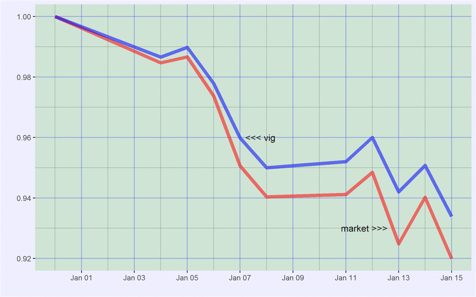
As far as the current (early 2016) market malaise goes, not surprisingly, dividend growth stocks are outperforming the market. Admittedly, they are getting hit but these are high-quality companies and they are not getting hit nearly as much as many other segments of the market, or the market itself:


An important tenet of Investing in Dividend Growth Stocks (Amazon) is that dividend growth stocks are core holdings because they generate good long-term risk-adjusted returns. They do so through a combination of moderate returns and relatively low volatility. Quoting from page 20:


"[A] portfolio [of dividend growth stocks] rises less than the market during bull markets and falls less than the market during bear markets. The latter more than makes up for the former. These stocks march to the beat of a different drummer -- but a very sensible one."


In my opinion, these stocks are excellent long-term investments (subject to not paying too much, as always, of course) for anyone who wants to preserve and build their wealth.


These are not gimmicky companies or slow-growth companies or risky companies. These are companies that last. They grow moderately over long periods, which when combined with relatively low return volatility results in strong gains in long-term wealth.

Friday, January 15, 2016

Probabilities for the S&P 500 weekly return

The previous post highlighted the relative rarity of 2016's week 1 return in the context of history. The following plot shows this in another way. It shows the probability density function (Wikipedia) for the S&P 500 weekly return based on history:


The green area highlights areas where the weekly return is positive; the red area highlights areas where the weekly return is less than -5 percent; and the blue area highlights the in-between areas.

With this probability density function, we deduce probabilities for the S&P 500 in any given week:

  • Probability of S&P 500 returning less than -10 percent in a week is 0.1 percent.
  • Probability of S&P 500 returning less than -5 percent in a week is 1.4 percent.
  • Probability of S&P 500 returning less than -2 percent in a week is 12.5 percent.
  • Probability of S&P 500 returning less than -1.5 percent in a week is 17.9 percent.
  • Probability of S&P 500 returning less than -1 percent in a week is 25.3 percent.
  • Probability of S&P 500 returning less than -0.5 percent in a week is 33.2 percent.
  • Probability of S&P 500 returning less than 0 percent in a week is 43.5 percent.
  • Probability of S&P 500 returning less than 0.5 percent in a week is 54.9 percent.
  • Probability of S&P 500 returning less than 1 percent in a week is 66.5 percent.
  • Probability of S&P 500 returning less than 1.5 percent in a week is 77.9 percent.
  • Probability of S&P 500 returning less than 2 percent in a week is 85.1 percent.
  • Probability of S&P 500 returning less than 5 percent in a week is 98.6 percent.
  • Probability of S&P 500 returning less than 10 percent in a week is 99.9 percent.

The second bullet agrees with the observation of the previous post, that the S&P 500 losing more than 5 percent in a week is about 1 in 70, or about 1.4 percent.

According to the  seventh bullet, the S&P 500 suffers a down-week 43.5 percent of the time. Consequently, the S&P 500 encounters an up-week 56.5 percent of the time. This fits the conclusion of an earlier post about daily returns -- that the market closes up on any given day about 53.7 percent of the time (though that post was based on a different set of data). Weekly returns show positive closes with a slightly higher up-probability than daily returns because of compounding. In fact, this logic works sequentially for all types of returns -- thus monthly returns have higher up-probabilities than weekly returns, annual returns have higher up-probabilities than monthly returns, five-year returns have higher up-probabilities than annual returns, and so on.

I zoomed in on the red area, where life is unpleasant:


If you are unfamiliar with probability density functions, here is the same data shown as a histogram. A histogram sorts the data and organizes it into buckets with the height of each bucket, in this plot, a count:


And a zooming-in of the nasty left tail shows the location of the first week of 2016:


Wednesday, January 13, 2016

2016's week 1 return among the 50 worst since 1950

The following plot shows the 50 worst weekly returns of the S&P 500 since 1950 (data from Yahoo! Finance):


The first week of 2016, highlighted in the upper right, is bad -- but not the worst. The worst is the 18.2 percent loss for the week ending October 10. If you recall that amusing period, within a week, Warren Buffett wrote "Buy American, I Am," http://www.nytimes.com/2008/10/17/opinion/17buffett.html, where he advocated being greedy during periods when others are fearful:

"Be fearful when others are greedy, and be greedy when others are fearful. And most certainly, fear is now widespread, gripping even seasoned investors."

Fear is not quite as widespread now as it was then but this thumping has likely taken quite a few investors back to the days of Fall 2008's halcyon panic. Undoubtedly, the market looks awful now -- and the carnage has started to become indiscriminate. A number of decent stocks have been hit, based entirely (most likely) on margin calls, stocks that will nevertheless report excellent numbers in the quarters ahead.

This table shows that the first week of 2016 -- with a weekly return of -5.96% -- is 32nd on the list of worst weekly returns since 1950:


Based on the full set of data, the chance of getting such a bad week (a weekly return of roughly -5% or worse) is roughly 15 out of 1,000 or roughly 1 out of 70 or roughly one week every 16 months. The market did not encounter any such weeks during 2012, 2013, and 2014. In 2015, it encountered one - the week ending 08/21/2015. That week, which saw a loss of -5.77%, is 36th on the list.

Perhaps we are due. Buckle up? Typically, these things do tend to occur in clusters:


This pattern shows clustering -- a tendency for movements to occur close to each other. Certainly, the movements are not random, in the sense that they occur somewhat regularly but without any discerning pattern. This is very different from movements about the mean or 0 -- which do show randomness. For instance, in an earlier post, we saw that randomness is characteristic of monthly returns about 0. Sharp falls have a separate nature unto themselves. They occur relatively rarely and they tend to cluster. Of course, predicting the first is next to impossible. Once you have the first, however, you can be reasonably sure of one or two others upcoming. Maybe.

In my book, Investing in Dividend Growth Stocks, I emphasize stability of returns for long-term investors precisely because I am not a fan of extreme movements for the typical long-term holder of any stock (you have no choice if you hold the market, which I am also not a huge fan of, but that story is for another day). Moreover, it is not difficult to show that if you have stability in your returns you tend to have a higher compounded return (read: wealth), all else equal. When you invest in unstable stocks and many markets you have to be certain not to get continually hammered as your long-term returns will invariably suffer. With generally stable markets such as the U.S. market, this "suffering" is not nearly as great as it is with many other markets. Essentially, this has to do with excess volatility acting like a leech, bleeding off your compounded return, hence wealth. From my book:

"If you had to choose between (a) two years of returns at 10 percent a year and (b) a first-year return of 0 percent a year followed by a second-year return of 20 percent a year, which would you choose? Although the average of both choices is 10 percent a year (the average of two tens is 10 and the average of 0 and 20 is 10), the stable growth of the first choice results in more wealth. With the first choice, for every $100 that you invest, you end up with $121; with the second choice, for every $100 that you invest, you end up with $120. Yes, all of $1 less; but what counts is the general principle: For a given average return, where the average is computed simply as the sum of the annual returns divided by the number of years, stable growth is always more valuable than fluctuating growth."

For more, see pages 76-81 of my book. If you do not have the book, you may be able to view the pages on Amazon if you use Amazon's look-inside feature for the book, here.

Wednesday, January 6, 2016

The wisdom of crowds -- growth rate in P/E ratio has contributed nothing to long-term stock-market returns


When you invest in a share of stock, you earn an annual return equal to, roughly, the sum of dividend yield, growth rate in earnings per share, and growth rate in P/E ratio:

\[
annual\,return=dividend\,yield+g_{eps}+g_{p/e\,ratio}
\]

(This formula is from my book, Investing in Dividend Growth Stocks. If you do not have a copy, you may be able to view the relevant pages, 7 through 10, at Amazon, here.)

Dividend yield assumes dividends are paid at the end of the year. Growth rates are defined as change divided by starting value, thus:

\[
g_{eps}=\frac{change\,in\,eps}{eps\,at\,start\,of\,year}
\]

and

\[
g_{p/e\,ratio}=\frac{change\,in\,p/e\,ratio}{p/e\,ratio\,at\,start\,of\,year}
\]

Our definition of annual return states that annual return is dividend yield (with dividends paid at the end of the year) plus a contribution from capital changes -- equal to growth rate in earnings per share plus growth rate in P/E ratio.

The purpose of this post is to show that, historically, of the contribution from capital changes to annual return, almost all has come from growth rate in earnings per share. That is, growth rate in P/E ratio has contributed almost nothing.

The following chart shows beginning-of-year P/E ratios for the S&P 500 between 1 January 1900 and 1 January 2016:


(The data for this chart comes from http://www.multpl.com/table. The 1 January 2016 P/E ratio is an estimate. P/E ratios are based on prices divided by trailing 12-month earnings per share. The median P/E ratio is 14.73; the mean, 15.77.)

More relevant to us, here, is change in P/E ratio. The following chart plots annual change in P/E ratio, 1900 through 2015:


Median annual change over this period, -0.085, is essentially 0. Mean, +0.076, is essentially 0 as well. Historically, therefore, on average, change in P/E ratio essentially equals zero

(Change in P/E ratio depends on period studied. Nevertheless, it is still quite small over most reasonably long periods -- exceptions such as the 1990s notwithstanding, though we all know what happened thereafter.)

As a consequence, growth rate in P/E ratio is essentially zero, on average, as well:

\[
g_{eps}=\frac{change\,in\,p/e\,ratio}{p/e\,ratio\,at\,start\,of\,year}=\frac{0}{p/e\,ratio\,at\,start\,of\,year}=0
\]

Returning to our formula for annual return, the only contributions to long-term stock-market annual return are thus, on average, dividend yield and growth rate in earnings per share. Growth rate in P/E ratio, on average, essentially contributes nothing. Going a bit further, quoting from my book, page 10, which, as noted earlier, you may be able to view at Amazon, here

"Dividend yield has historically produced about one-third of market returns; capital gains, about two-thirds. Moreover, of the contribution from capital gains, almost all has come from growth rate in earnings per share. That is, over long periods, growth rate in P/E ratio has contributed nothing. Sometimes, it has added. At other times, it has subtracted. Net, it has produced nothing."

Funny how things worked out this way, almost as if scripted -- by some invisible hand, https://en.wikipedia.org/wiki/Invisible_hand. This happy circumstance is probably a testament to, by and large, the stock market operating properly -- the stock market, by and large, pricing things correctly. After all, if P/E ratio is on average correct, change in P/E ratio is on average zero. Occasionally, we have manias -- followed inevitably by panics -- but, averaged over time, the market gets it right, a vindication, perhaps, of the wisdom of (investing) crowds.

Sunday, January 3, 2016

The randomness of monthly returns and the Lake Wobegon effect

More than 70% of U.S. drivers believe they are better-than-average drivers, an example of the Lake Wobegon effect, https://en.wikipedia.org/wiki/Lake_Wobegon#The_Lake_Wobegon_effect.

Likewise, a higher than expected number of investors probably believe they are better-than-average investors. Essentially, in the stock market, this means they can spot patterns. For instance, they believe they can pick the perfect stock. They believe they know when to buy and when to sell. They believe they know when to exit the market. Most of this is hindsight bias as well -- investors looking at the past and saying they would have bought this or that at the right time and sold this or that at the right time. I am not saying it is not possible but it isn't easy. Some may certainly know how -- but it is likely very few.

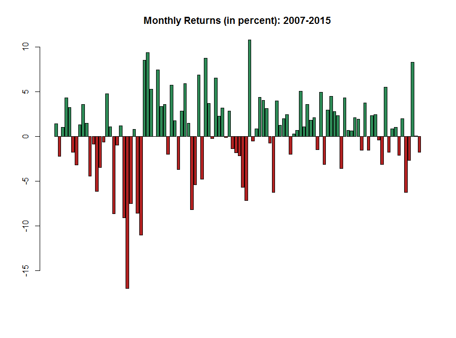
The following chart shows the monthly returns (in percent) for the S&P 500, price only, between 2007 and 2015:


I took the returns and simply characterized them as up or down in the following chart:


Perhaps there are patterns here and maybe some say they are obvious. But are they? I used a statistical test called a runs test to check the randomness of the pattern. When I ran the test, I got a result that indicated the pattern was very likely random. In turn, this means monthly returns are very likely random. (In statistical jargon, I get a p-value of 0.8782. Generally, for this test, a p-value below 0.05 suggests a lack of randomness. Here, the p-value is significantly larger than 0.05 -- thus suggesting randomness.) 

If the result of a game is random, it is difficult to play the game many, many times and finish significantly above average -- regardless of what we think of our abilities. Sometimes we get it right. At other times, we get it wrong. Few of us get it consistently right -- and that too is explainable mostly as luck. Think of it this way: You, or I -- or even the residents of Lake Wobegon -- cannot consistently call the next flip of a coin.

Wednesday, December 30, 2015

The error in analyst stock-price targets


Typically, analysts generate a (one-year) stock-price target by taking the product of P/E ratio, estimated one year out, and earnings per share, E, also estimated one year out:

\[ Price\:Target=\frac{P}{E}*E \]

All such estimates are subject to error. The error in doing so is given by:

\[ Error_{Price\,Target}=\sqrt{\left(Error_{P/E}\right)^{2}+\left(Error_{E}\right)^{2}} \]

Error in Analyst Stock-Price Target


For a typical stock, we can assume an error of 10% in P/E ratio, a not unreasonable value, and 5% in earnings per share, E -- typically lower than error in P/E ratio for many, but certainly not all,  stocks. Putting these values into the above equation we get:

\[ Error_{Price\,Target}=\sqrt{\left(0.10\right)^{2}+\left(0.05\right)^{2}} \]

Or:

\[ Error_{Price\,Target}=11\% \]

View this 11% as the minimum error of almost any analyst (one-year) stock-price target (exceptions: sedate stocks such as utilities and consumer staples stocks where the error is lower). Thus if the stock price is currently 50 and the analyst expects it to be 60 based on her estimates, the actual stock-price target is 60 + or - 11%, thus, 53 to 67. Consider how wide this range is relative to the point estimate of 60. If price targets were ever reported this way, investors would immediately appreciate the problems inherent in this type of prediction.

In effect, the problem arises because 11% approaches the expected return of a typical stock and the error essentially overwhelms the return implied in the stock-price target. For instance, a more reasonable -- and typical -- analyst stock-price target in the previous example is 55. In this case, the actual stock-price target is 55 + or - 11%, thus, 49 to 61, a wide range, to say the least. Contrast this with the target of 55 and the current price of 50. The current price is within this range! The expected returns (assuming no dividends) range from -2% (if the stock hits 49) to 22% (if the stock hits 61). Many consider this range of returns -- quite correctly -- absurd. It's a bit like standing on a scale and having the scale read 170 pounds + or - something totally unreasonable, (say), 20 pounds.

Incidentally, P/E ratios of certain stocks vary much more than 10%. In these cases, stock-price targets calculated as P/E ratio times earnings are almost pointless. For instance, with an error of 25% in P/E ratio and 15% in earnings per share, the error in analyst (one-year) stock-price target is 29%. That's big enough to drive a Hummer through.

Finally, note that the bulk of the error in both cases is because of error in P/E ratio. It is a truism that P/E ratios are almost impossible to judge a year out (or indeed over any long period). This means that not only are analyst stock-price targets one year out fraught with error, as we have seen, but that valuation methods that depend on estimates of P/E ratio are fraught with error too -- and must be questioned. Too often, investors and analysts generate a stock-price target by multiplying estimated P/E ratio by estimated earnings per share, not realizing the potentially catastrophic mistake that they are making. They put a lot of thought into estimating earnings per share, but, for most stocks, the (expected large) error in P/E ratio brings into question the ultimate validity of any stock-price target calculated this way.

Friday, December 12, 2014

What is the probability that the stock market closes higher on any given day?

The punch line: The probability that the stock market closes higher on any given day is (only) 53.7%. That's it. Better than flipping a coin, but not by much. The rest of the time it finishes lower (45.2% of the time) or unchanged (1.1%). Yet, because of compounding, this is all that it takes to produce a trend -- and a strong uptrend -- over time.*

---

On any given day will the stock market rise or fall? I used daily adjusted closing price data from Yahoo! Finance for SPY, the S&P 500 ETF to find out. The data span 01/29/1993 to 12/11/2014. Here is a bar chart with results grouped by year:


---

The bar chart is not zeroed on the y-axis and is scaled to make the differences apparent. The probability of up days spans a range of 47.4% (in 2002) to 59.2% (in 2014). On any given day, the stock market will rise 53.7% of the time (and fall or remain even 46.3% of the time). Your odds of making money are roughly 27:23, or even more roughly, 6:5. That's it. Don't bet the farm. For such a short period as a day, you're essentially tossing a coin.

---

*  I'm almost certain that this phenomenon is similar to why a tiny preference by people for some attribute leads to a clustering of those attributes around a geographic area over time. In other words, what we expect to be a random distribution of attributes over geographic area instead exhibits a clustering effect. Likewise, for us, what we expect to be a random distribution of stock prices over time, instead behaves -- when there's a slight increase in chance -- as a strong trend of gradually rising prices.

Friday, November 14, 2014

How have the biggest losing stocks of 2013 fared so far

The punch line: The accepted wisdom, really theory, is that big losers of one year become big winners the next year. Buy the losers in December. This theory is invalid -- or at least should be modified as far as it pertains to all stocks. The theory may have validity for the huge companies of the Dow, where companies do tend to come back and companies rarely fail. With most other stocks, however, total failure is a genuine possibility. Big losers of one year can become even bigger losers the next year because they have systemic troubles. In general, stay away from companies with systemic troubles. They can dissolve into nothingness. If a preliminary pass to avoid such stocks is made, returns improve.

---

Method: I took a random list of big stocks that were losers in 2013, "Fortune 500: Worst-performing stocks of 2013," http://money.cnn.com/gallery/investing/2013/12/19/fortune-500-worst-stocks/, and calculated how they have performed YTD in 2014. I just read off the returns from Yahoo! Finance. Thus things like bad data, dividends (potentially), and reorganizations are not considered.

---

Results: A portfolio of the fifteen worst stocks of 2013 has returned -10% so far this year, underperforming the +10% return of the index. However, it gets more interesting when the group is broken down into two constituents: (a) companies with long-term troubles; and (b) the rest. The stocks in group (a), indicated by a comment in the last column below, have returned -37%. When you have that many coal stocks and one bankruptcy (or close to it, NIHD lost 97% and now trades on the pink sheets as NIHDQ -- I've used -100% in the table) that is bound to happen. The gold miner may not be in long-term trouble but gold has done poorly over the long term. The stocks in group (b) have returned a more respectable +13%, ahead of the market by 3 percentage points. Here is the breakdown:


---

Conclusion: You have to be careful buying losers, as far as it pertains to most stocks. The best bet is to avoid those with systemic troubles. You need to do a preliminary pass and weed out such stocks. If this is done, buying the remaining losers (as a group) can work though you have to be careful and pretty patient.

Thursday, June 20, 2013

Portfolio returns versus risk, a spreadsheet model to calculate portfolio beta

The punch line: Weigh your portfolio's performance, that is your returns, against the risk that you are taking.

---

Beta is not an ideal measure of risk but when looking at how your portfolio fluctuates from day to day it isn't bad. It certainly measures how much your stock moves relative to the market -- and you can use this fact to gauge what the market thinks of your stock.

---

This is especially important if you have an aggressive portfolio and the market is weak. You don't want to panic and sell foolishly. For example, suppose your aggressive portfolio's beta is 1.5. Suppose the market falls seven percent. (It can be a daily fall or a multi-period fall.) Then your portfolio should be expected to fall 1.5 * 7 or 10.5 percent. Now, if during a market fall, your portfolio falls "only" (say) 5 percent, that's not bad. You are outperforming the market relative to the risk that you are taking. If, on the other hand, your portfolio falls (say) 15 percent, that's bad. You are underperforming the market relative to the risk that you are taking.

You might think that a fall of 5 percent is bad. You lost money. And in that sense it is. But you cannot be expected to never lose money and always earn money! What you are hoping for instead is that you are more than compensated for the risk that you are taking. What you are hoping for is that the smaller fall in your portfolio value relative to the market during downturns implies that you've got good individual stories. Holders in your stocks believe in these stories and are not willing to sell during market downturns. Over the longer term, these better-than-expected stories should lead to better-than-average returns.

---

Here's a spreadsheet that shows how to calculate your portfolio's beta using Excel:


The spreadsheet is straightforward. It uses the result from here, http://www.neocadence.com/2013/06/calculating-beta-of-portfolio.html, that is, the beta of a portfolio is the sum of its weighted betas.

Column C lists your positions.
Column D lists how much you have in dollars in each position.
Cell D24 is the total value of your portfolio, the sum of the individual values.
Column E are the percentages, or weights, equal to the values in Column D divided by D24.
Column G lists the betas. You can get these from a site such as Yahoo! Finance.
Column H are the weighted betas, equal to Column E times Column G.
Cell H24 is your portfolio's beta, the sum of the weighted betas.

(The beta for cash is zero. You can include mutual funds and ETFs here as well.)

---

If your portfolio falls less than what is expected, you've got individual stories that are trumping the market's weakness. That's good -- you've got so-called positive alpha. If your portfolio falls more than what is expected, you've got individual stories that are playing out worse than the market's weakness. That's bad -- you've got so-called negative alpha.

Friday, June 14, 2013

Calculating the beta of a portfolio

The punch line: The beta of a portfolio is the sum of its weighted betas.

---

It is not difficult to see why.

Beta, as originally defined by I believe Sharpe sometime around 1962, is the slope of a linear regression line when the market's excess return is plotted on the x-axis and the stock's excess return is plotted on the y-axis.*

---

Accordingly, per the formula for the slope of a linear regression line:

\[ \beta=\frac{Cov\left(r,R\right)}{Var(R)} \]

Here, Cov stands for covariance and Var for variance. The lower-case r is for the stock and the upper-case R is for the market.

---

For a portfolio of two stocks, A and B, because the return of a portfolio is the sum of its weighted returns, the formula becomes:

\[ \beta=\frac{Cov\left(w_{a}r_{a}+w_{b}r_{b},R\right)}{Var(R)} \]

Here the w's represent the weights of each stock in the portfolio. For example, if a portfolio is 70% IBM and 30% JNJ, the weights are 0.7 for IBM and 0.3 for JNJ.

---

Conveniently, because the covariance function is linear in its arguments, in particular its first argument:

\[ \beta=\frac{w_{a}Cov\left(r_{a},R\right)+w_{b}Cov\left(r_{b},R\right)}{Var(R)} \]

Or:

\[ \beta=\frac{w_{a}Cov\left(r_{a},R\right)}{Var(R)}+\frac{w_{b}Cov\left(r_{b},R\right)}{Var(R)} \]


Or:

\[
\beta=w_{a}\beta_{a}+w_{b}\beta_{b}

\]

---

In other words, the beta of a portfolio of two stocks is the sum of its weighted betas. The result extends to three or more stocks and, indeed, to not just stocks but to any assets -- as long as the definition of beta makes sense.

---

To see how this works in real life, suppose you own a portfolio, 70% of which is in IBM, with a beta of 0.7, and 30% of which is in JNJ, with a beta of 0.5. The weighted beta for IBM is 0.7 * 0.7 or 0.49. The weighted beta for JNJ is 0.3 * 0.5 or 0.15. The beta for the portfolio is the sum of the weighted betas, that is, 0.49 + 0.15, or 0.64. Piece of cake, right?

---

* Excess return is return over and above the return of a risk-free asset. In other words, excess return of an asset is the return of the asset minus the return of a risk-free asset. If a stock's return is 5% and a risk-free asset's return is 1%, the stock's excess return is 4%.

Tuesday, April 16, 2013

On Screeners

Few free screeners have all the variables that you will need to run a thorough stock screen. In fact, you'll often have no choice but to screen on a smaller set of variables. But because it is a smaller set, you'll have to deal with more potential candidates than you otherwise would. That's extra work -- and never any fun.

If you want to do better, you'll (unfortunately) have to pay: The screeners that aren't free have a cornucopia of variables. Examples are the screeners from YCharts (Gold and Platinum) and AAII.

Monday, March 4, 2013

Share buybacks: Net is better

Share buybacks are one of two methods that companies use to return capital to shareholders. The other method is dividends.

But share buybacks have many little wrinkles. One that I will discuss here is a subtle one: Look at net share buybacks, not gross share buybacks. That is, subtract from share buybacks the cash that the company receives from the shares that it issues. It seems simple enough but companies often trumpet their share buybacks without asterisking that they offset at least a portion of the buybacks with issued shares during the year.

---

As an example, suppose a company has 400 million shares outstanding. If it buys back 20 million shares in one year, that's 5 percent of its shares outstanding and pretty impressive. But more often than not when you look at the company's financial statements, you will find that the drop in shares outstanding is far less than 5 percent. That's because companies continually issue shares -- and when companies are too generous with share issuance, that 5 percent drop can be anything but. For instance, if in our example the company issues 10 million shares, the drop is 2.5 percent. The gross buyback in this case is 5 percent; the net buyback, 2.5 percent. If the company issues 20 million shares, there is no drop. The gross buyback is still 5 percent; the net buyback is now 0 percent.

---

To be fair, newly issued shares do have benefits. They motivate management and employees; they can be used for acquisitions.

But benefits like these have to be offset against the relatively expensive cost of issuing shares. Equity is a valuable commodity. It should not be doled out like popcorn.

---

This problem is especially endemic with tech companies. Intel may have started this trend a few decades ago -- and it has certainly worked for them. But the trend accelerated in the early 1990s and now borders on the drunken and ridiculous. Yet companies cannot stop. Their employees or managers will just waltz over to the competition, the entity that is still generously doling out shares.

---

Always check how many shares companies issue when they tout how many shares they buy back.


Monday, February 25, 2013

Useful Tax Publications for investors


Useful IRS publications for investors include:

• Publication 969 -- Health Savings Accounts and Other Tax-Favored Health Plans;

• Publication 550 -- Investment Income and Expenses (Including Capital Gains and Losses);

• Publication 590 -- Individual Retirement Arrangements (IRAs);

• Publication 575 -- Pensions and Annuities;

• Instructions for Form 1040 (Schedule B) -- Interest and Ordinary Dividends; and

• Instructions for Form 1040 (Schedule D) -- Capital Gains and Losses.)

Monday, February 18, 2013

16-year-old day trader, Rachel Fox

You know the market is topping when the media puts out stories like these.

16-year old actress, Rachel Fox, placed 338 trades last year. She did well, a 30.4 percent return, but the market did well last year too -- though not as well, around 16 percent. Take out taxes from her return, say a third, because her returns would be taxed hard because of short-term gains, and her return drops precipitously, but still, to be fair, she did quite well. We also do not know if her returns exclude expenses, though I suspect they do.

Nevertheless, this reminds me very much of stories that come out when the market is topping. Remember the truck-drivers planning to buy their own islands during the late 1990's? Bull markets make geniuses of us all. They make geniuses of newbies as well -- Rachel Fox only started trading in November 2011. Either she's incredibly lucky or she's incredibly gifted. I'll reserve judgment and say she's incredibly lucky. She needs to experience a bear market and then a couple more.

---

The market at any given point suits certain personality types best. But few personalities are mutable, few personalities can adapt to the market's ever-changing state. Thus, there will be plenty of occasions when a certain personality type that does well in one type of market loses his or her shirt in a different type of market.

---

Source: http://goo.gl/tYt5W

Friday, February 15, 2013

Dividend reinvestment

When you reinvest your dividends, the highest percentage increase in income occurs when the share price is lowest on the prior reinvestment date.

This is the result of the reinvested dividends buying the most number of shares when the share price is low.

---


Conversely, the lowest percentage increase in income occurs when the share price is highest on the prior reinvestment date.

This is the result of the reinvested dividends buying the least number of shares when the share price is high.

---

This is nothing but a variant of "buy low, get more."


Thursday, February 14, 2013

Of Models and Simplicity in the Stock Market

Because we cannot know much about the future, we must appeal to models invoking simplicity when investing; but don't make things so simple that they become simplistic -- and wrong.

Judging individual stocks based on their PEG ratios is one instance of simple models becoming simplistic and wrong.